Most classroom teachers have access to spreadsheet software, either through commercial packages like Microsoft Excel or free software such as Geogebra or Gnumeric. While these can be used effectively to explore statistics, they have some major drawbacks. Firstly, the toolkit of statistical techniques available is limited, and secondly, the idiosyncrasies of selecting the correct data range and getting the axis right can be frustrating for both teachers and students.
R is a free package of statistical tools used by many statisticians in the world beyond the classroom. It is free to install and works a little like a programming language so the barrier to entry is quite high; however it is possible to find a way in with a few simple commands that allow much greater control and flexibility than a spreadsheet would. An added benefit is that students who may go on to further education and jobs that require statistical analysis will be familiar with the basic syntax and toolkit they will be expected to use.
Again, with coding gaining status in KS2 and KS3 in the UK, students will soon be more familiar with the basic concepts of using a programming language than many of their teachers – so now is the ideal time to start playing with packages like R.
Getting started
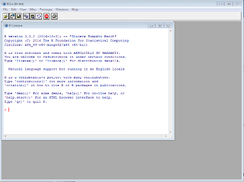
R can be downloaded for free here and is easily installed (ask your tech team nicely!). Once up and running, your workspace will look something like the image below. Over the course of this blog you will learn how to import some data from a csv file (like a spreadsheet or database) and plot a simple frequency graph.

The first thing you need to know is the “working directory”, the default directory in which your data should be stored. To do this, type the command getwd() and hit enter; this will return a location.

It may be that you would prefer to set the working directory to a different folder on your system, which can be done using the setwd() command and typing a new folder location in quotation marks inside the brackets.

Importing data
To store data in R it must be assigned to a named object. If you are familiar already with basic coding this is similar to assigning to a variable in a language like Python.
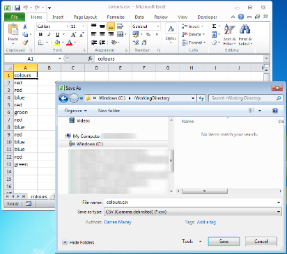
First record some data in a csv file. The easiest way to do this is to create a column of data in a spreadsheet and select “save as”, choosing the CSV format, and save to your working directory.

You now need a new command, read.csv() which does exactly what it says on the tin – instructing R to read the contents of your csv file – and looks like the line of code below.

This may seem a little daunting, but once you know the format it is both easy to read and to extend to other situations.

Box 1 is the object to which the data is being assigned: this can be any word you choose, but make it descriptive as you need to remember it to use when interacting with the data. This data is a list of colours, so “colourData” seems a good choice.
Box 2 is the assignment operator: this tells R that it should do whatever command comes next to our object.
Box 3 is the name of the data file: if you have saved this in your working directory there is no need to add a filepath.
Box 4 tells R to treat the first row as the name/description of the data set. If your data didn’t have a field name, this could be set to FALSE.
If you have saved your data with a different name, simply change the filename to match yours. There are other parameters that can be added between the brackets but for our current purposes, this is plenty.
To check if your data has been assigned correctly, simply type the name of the object and hit enter.

My first graph
To draw a graph now could not be more straightforward! Simply type the following and hit enter.

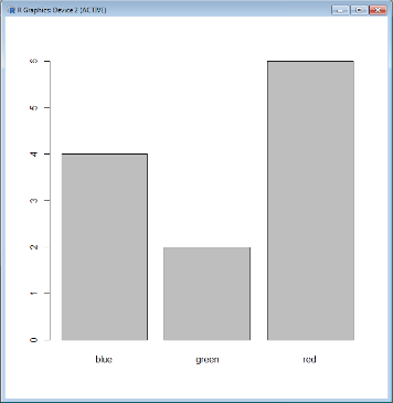
Hey presto! A new window will appear with a bar chart of your data.

As with the read.csv() command, there are more parameters that can be added between the brackets to customise the appearance of the chart, which will be explored in the next blog. In the meantime, try running the command below and see if you can work out what each parameter is doing. Then share your graphs with us on twitter @Cambridgemaths.
